:format(webp))
:format(webp))
Tailwind CSS vs CSS Modules vs Styled Components — which fits your project?
Read this and you'll walk away with a practical comparison of Tailwind, CSS Modules, and styled-components plus the often-missed trade-offs around design systems, monorepos, SSR, type safety, runtime costs, accessibility, theming, and migration strategies. Every important claim links to a source so you can verify and explore further.
Short primer: what each approach is at a glance
Tailwind is a utility-first CSS framework that generates atomic classes and a configurable design system you apply via class names in markup. See the official Tailwind CSS documentation for more details.
CSS Modules are a build-time technique that scopes normal CSS files to components by producing locally-scoped class names, leaving CSS authored in a familiar stylesheet syntax. Learn more in the CSS Modules spec on GitHub .
styled-components is a CSS-in-JS library for React that lets you write styles inside JavaScript, produces styled React components, and injects styles at runtime (with SSR helpers). The styled-components documentation provides in-depth guides.
Approach | Description | Documentation Link |
|---|---|---|
Tailwind | Utility-first CSS framework with atomic classes and a configurable design system | https://tailwindcss.com/docs |
CSS Modules | Build-time CSS scoping to components using familiar stylesheet syntax | https://github.com/css-modules/css-modules |
styled-components | CSS-in-JS library producing styled React components with runtime style injection | https://styled-components.com/docs |
When the usual pros & cons matter
Each top-ranking guide already lists common advantages and downsides (learning curve, DX, bundle behavior, theming). Here are short summaries with sources you can check.
Tailwind pros: predictable utility API, rapid layout iteration, and a theme system driven by a single config file.
Tailwind cons: markup can become class-heavy; content scanning is required to remove unused classes for production builds, as explained by PurgeCSS .
CSS Modules pros: local scoping by default, no runtime library required, familiar stylesheet syntax.
CSS Modules cons: you still manage CSS cascade and global concerns; tooling is needed for typed imports in TS, according to Create React App’s guide to CSS Modules .
styled-components pros: colocated styles with components, dynamic props-driven styling, theming via ThemeProvider.
styled-components cons: runtime style injection unless you use optimizations; requires SSR handling to avoid flash-of-unstyled-content.
Approach | Pros | Cons |
|---|---|---|
Tailwind | predictable utility API; rapid layout iteration; single-config theme system | class-heavy markup; requires content scanning for unused classes |
CSS Modules | local scoping by default; no runtime library; familiar syntax | must manage CSS cascade; requires tooling for typed TS imports |
styled-components | colocated styles; dynamic props-driven styling; ThemeProvider theming | runtime injection overhead; needs SSR handling to avoid FOUC |
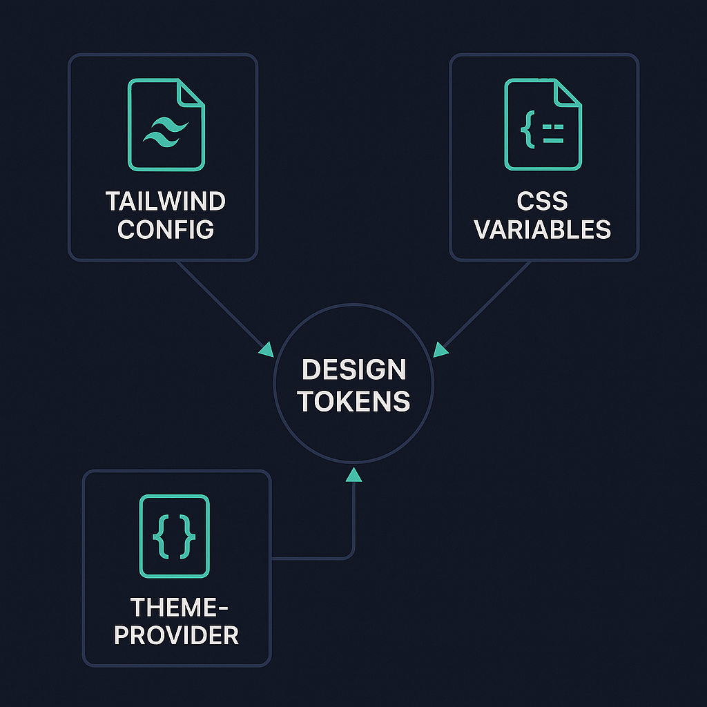
Design systems and tokens: how each approach expresses the system
Tailwind encodes design tokens in its configuration (colors, spacing, fonts) which you can extend and share as a canonical source across projects; Tailwind’s theme config is the primary token surface.
CSS Modules work well with CSS custom properties (CSS variables) for tokens that can be used at runtime for theming or exposed as a shared token package across apps. The MDN guide to CSS custom properties shows patterns for runtime themes.
styled-components uses JS theme objects consumed by ThemeProvider, which enables token composition and runtime token logic (useful for white-label or per-user customization).
Practical note: if designers expect token editing in Figma and want a one-file source you can publish to multiple apps, Tailwind config or a dedicated token package (Style Dictionary) is easy to sync; CSS variables are best when you need runtime theme overrides.
Scalability in very large codebases and monorepos
Sharing styles and enforcing consistency in a monorepo (Nx, Turborepo, Lerna) favors build-time artifacts you can import rather than runtime style logic that’s scattered.
Tailwind: share a centralized config package and import it across apps; works well with monorepo caching and remote caching tools. See Nx’s documentation for general monorepo patterns.
CSS Modules: share a library of components with their CSS files, or publish a shared token CSS file; because styles are static files, they play well with build caching.
styled-components: you can publish component packages that include their JS and theme contracts, but runtime styles mean bundle/runtime differences across apps and more careful versioning when tokens change. Tools like Turborepo still help, but you need stricter coordination on styled-component versions and theme shapes.
Refactor cost: when you need to refactor tokens or break down a shared UI primitive, Tailwind + config or CSS Modules + shared stylesheet tend to produce smaller, more predictable diffs than dispersed runtime styles in many JS packages.
Server-side rendering, streaming, and critical CSS
Tailwind and CSS Modules produce static CSS at build time (or static compiled CSS), which lets you ship a stylesheet and rely on the browser for hydration; Next.js + Tailwind is a common pattern.
styled-components injects styles during rendering and provides ServerStyleSheet to collect styles on the server; you need SSR integration to avoid flash-of-unstyled-content (FOUC) and to extract critical CSS.
For streaming SSR (e.g., React streaming in Next.js/Remix): build-time/static CSS avoids duplication and simplifies progressive rendering; runtime-injected CSS requires careful ordering to ensure styles arrive with streamed chunks. See the Next.js streaming guide .
Approach | Build-Time CSS | Runtime CSS Injection | SSR Integration Complexity | Streaming SSR Support |
|---|---|---|---|---|
Tailwind/CSS Modules | Yes | No | Low | High |
styled-components | No | Yes | Medium (requires ServerStyleSheet) | Medium (ordering concerns) |
Type safety and IDE support
Tailwind: strong VS Code autocomplete exists (Tailwind IntelliSense) that gives class suggestions from your config, and you can get typed tokens by generating types from your config. Install the Tailwind CSS IntelliSense extension .
CSS Modules + TypeScript: you can generate .d.ts files for CSS imports (typed-css-modules or TypeScript plugins), enabling class name autocompletion and compile-time checks. See the typed-css-modules package on npm .
styled-components + TypeScript: styled-components ships TypeScript typings; props-driven styles can be fully typed so the IDE surfaces prop shape and token use.
If you need strict type guarantees across tokens and components, CSS Modules with generated typings or a typed token export (JS/TS token package) gives the most immediate type-safety without runtime concerns.
Runtime performance in highly dynamic UIs
Tailwind and CSS Modules are static CSS techniques (no runtime stylesheet generation), so they avoid per-render style work and minimize JS on the hot path.
styled-components performs work at runtime to resolve props and inject styles; that gives power for dynamic styles but adds CPU and allocation overhead that can show up in tight UI loops unless you optimize (memoization, using static styles when possible, or Babel/SWC tooling). For a detailed performance analysis, refer to this CSS-in-JS performance overview .
For highly dynamic UIs (e.g., hundreds of animated items), prefer static classes or CSS variables combined with utility classes to keep runtime costs low; use profiling (browser DevTools) to find hot spots.
Theming and dark mode at scale
Tailwind supports dark mode and theme extensions via its config and class or media strategies; its plugin ecosystem includes color-mode utilities.
CSS Modules + CSS variables let you switch themes by toggling root custom properties with near-zero JS overhead and fast repaint.
styled-components' ThemeProvider makes switching themes simple in React and supports nested theme contexts, but it is a runtime pattern and requires re-rendering consumers on theme changes.
At large scale, CSS variables give the most performant theme switching; Tailwind is great when you can express theme variants as classes or when you compile multiple theme builds.
Bundle size, tree-shaking, and build pitfalls
Tailwind’s JIT/content scanning removes unused utilities at build time, keeping final CSS small when configured correctly — but misconfigured content paths can lead to missing styles.
CSS Modules produce CSS that is part of the component bundle; dead components still bring their CSS into app builds unless your bundler tree-shakes them.
styled-components adds a runtime dependency and some JS cost; use Bundlephobia to inspect package size and the Babel plugin / SWC transforms to reduce runtime overhead.
Debugging and developer experience in the browser
Tailwind class names are explicit and readable in the DOM, which helps map markup to styles quickly; the IntelliSense and source config make it easier to reason about classes.
CSS Modules generate scoped class names; source maps or readable-name patterns from build tools can help map the DOM back to source files.
styled-components generates hashed class names by default, but the Babel plugin adds displayName and better debugging. You’ll still inspect component names rather than handcrafted class names in the DOM.
Integrating with component libraries and headless UI kits
Tailwind pairs naturally with Headless UI (by the same maintainers) and Radix primitives — both expect unstyled markup you can style with utilities. See Headless UI and Radix Primitives for examples.
CSS Modules and styled-components both integrate with design-system components; MUI supports emotion/styled-components as style engines. Learn more in the MUI interoperability guide .
Choose Tailwind if you rely heavily on headless primitives and want a consistent utility language across libs; choose CSS Modules or styled-components if your design system packs components with encapsulated styles.
Accessibility workflows
Utility classes (Tailwind) can encode accessibility-ready patterns (focus rings, visually-hidden utilities), making consistent a11y implementation easier across teams.
styled-components lets you colocate semantics and styles so you can create accessible primitives that bundle ARIA, keyboard behavior, and styling, but bundling increases the need for shared patterns across teams.
CSS Modules rely on the developer to enforce a11y patterns — linters and shared components help. Use tools like axe-core for testing.
Debugging migrations and preventing CSS drift
Large teams risk “CSS drift” (duplicate similar rules, inconsistent spacing/variants). Strategies:
Centralize tokens (Tailwind config or token package).
Enforce style linting and codemods for gradual migrations (stylelint, eslint rules). Refer to the Stylelint documentation for setup.
Use visual regression tests to catch unintended changes (Percy, Chromatic). See Percy and Chromatic for tools.
Migration strategies between approaches
From global CSS to Tailwind: incrementally adopt utilities inside components while keeping global styles; use Tailwind’s arbitrary values or custom classes for edge cases.
From styled-components to static CSS: extract stable styles into CSS Modules or utility classes first, keeping dynamic pieces in JS until you can remove them. Community codemods and scripting help automate repetitive conversions.
Hybrid setups are normal: you can use Tailwind for layout and a CSS Modules/styled-components layer for highly dynamic or component-scoped needs.
Non-React ecosystems
Tailwind is framework-agnostic — works with Vue, Svelte, Angular, Solid.
CSS Modules are supported in many bundlers and frameworks via loaders (Vue loader, Svelte preprocessors). See the Vue loader guide to CSS Modules .
styled-components is React-focused; similar patterns in other ecosystems are available (e.g., emotion for React, or scoped styling features for Vue/Svelte).
If you expect cross-framework longevity, prefer Tailwind or static CSS approaches.
Testing strategies: which selectors survive refactors
Visual regression testing (Percy/Chromatic) is framework-agnostic and catches layout regressions regardless of styling method.
Unit/integration tests should avoid brittle DOM-based assertions. Use resilient queries (role, text) from Testing Library and reserve class-based assertions for contracts. Follow the Testing Library cheat sheet for guidance.
Tailwind utilities can make snapshot tests verbose but stable; CSS Modules give stable local class names if your build preserves predictable naming; styled-components’ generated names change unless you enable readable displayName via tooling.
The final word
Pick for the shape of the product, not the hype
Your choice should follow constraints: team skills, need for runtime dynamism, SSR strategy, monorepo sharing expectations, designer handoff process, and profiling of hot UI paths. Tailwind gives a strong, shareable config and speed for many teams; CSS Modules minimize runtime surprises; styled-components shines when styles must react to JS-heavy state and you’re committed to a React-only stack with proper SSR.
:format(webp))
:format(webp))
:format(webp))